RICKER LIBRARY POSTERS
Project Brief
These posters were designed as part of a classroom set that would spell out the words "Ricker Library." They were displayed on the windows of the Architecture Building's Ricker Library on campus for about two years after completion. The project itself was meant to develop our skills with letter design, dropcaps in particular..
Sketches & Studies
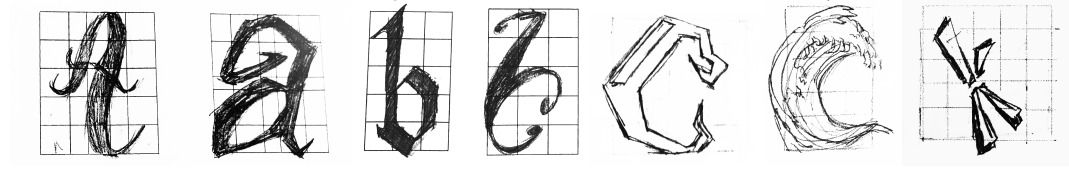
The first portion of the project was to produce 30 different sketches of the letters within
the phrase "RICKER LIBRARY", and then narrow it down to 6-7 ideas. We visited the Ricker Library to gain
some inspiration
from the available books in their collection. The overall vibe of the posters needed to give off that the
library was welcoming, warm, and fun!
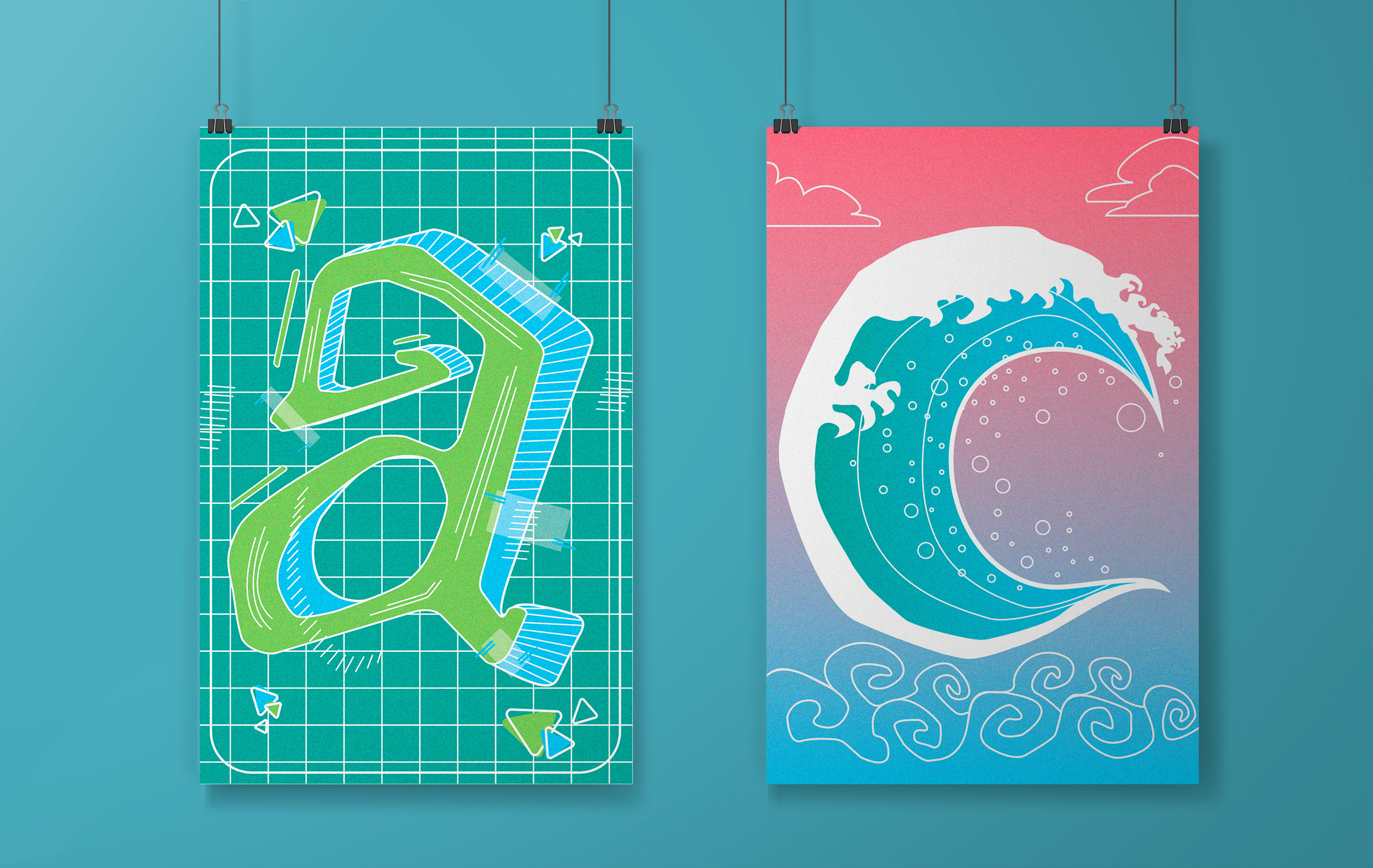
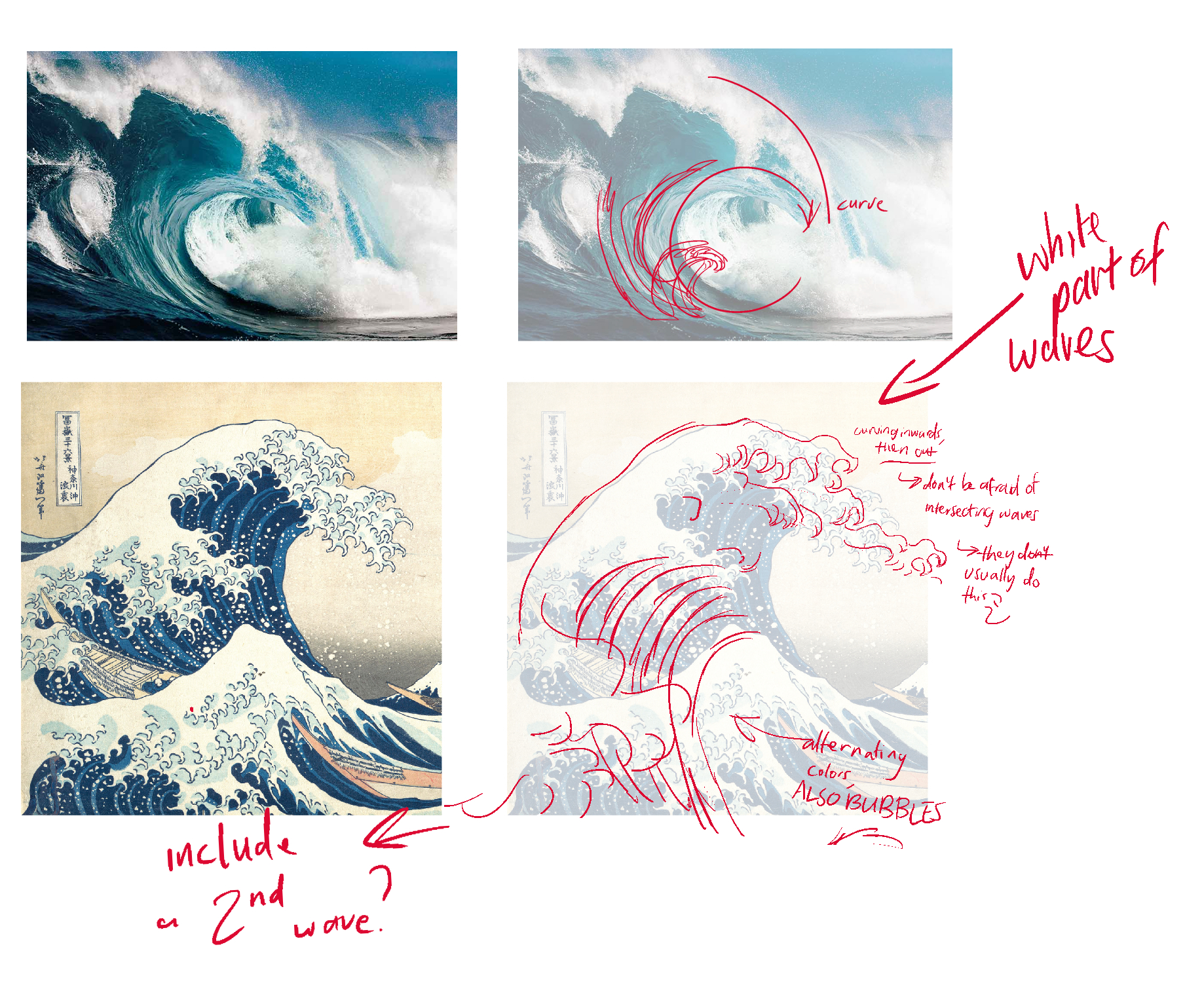
I noticed that the library offered a few books on Haruki Murakami, the artist behind the iconic woodblock
print "The Great Wave at Kanagawa." I knew that this artwork in particular
is very well known with students my age, so I settled on creating a wave for one of my posters. I also
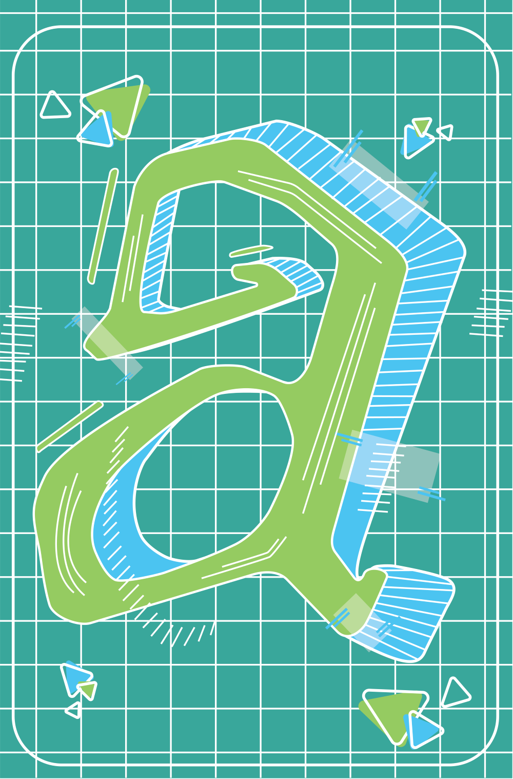
decided on creating a lowercase letter "A" poster because I felt that the form could
be experimented on more than an uppercase version.
Drafts


Final Product

Takeaways
I was not that comfortable using Adobe Illustrator before this project, but I improved on my vector design techniques by refining both letters. I was consistently receiving feedback that I needed my designs to be bolder, so I began incorporating the backgrounds into the posters to give each letter more personality. Another challenge that I faced was trying to incorporate the assigned color palette to remain cohesive, so I played around with gradients and line weights.