BRISBANE 2032 OLYMPICS BRAND SYSTEM
Project Brief
This was a semester-long project to develop a visual identity system for a future Olympic host city. My assigned Games was the Brisbane 2032 Summer Olympics. I didn’t know too much about Brisbane before this assignment, so I started my design process by researching the city and the greater Queensland area. From there I choose three words to guide my visual branding process: aquatic, friendly, and fun!
Style Guide
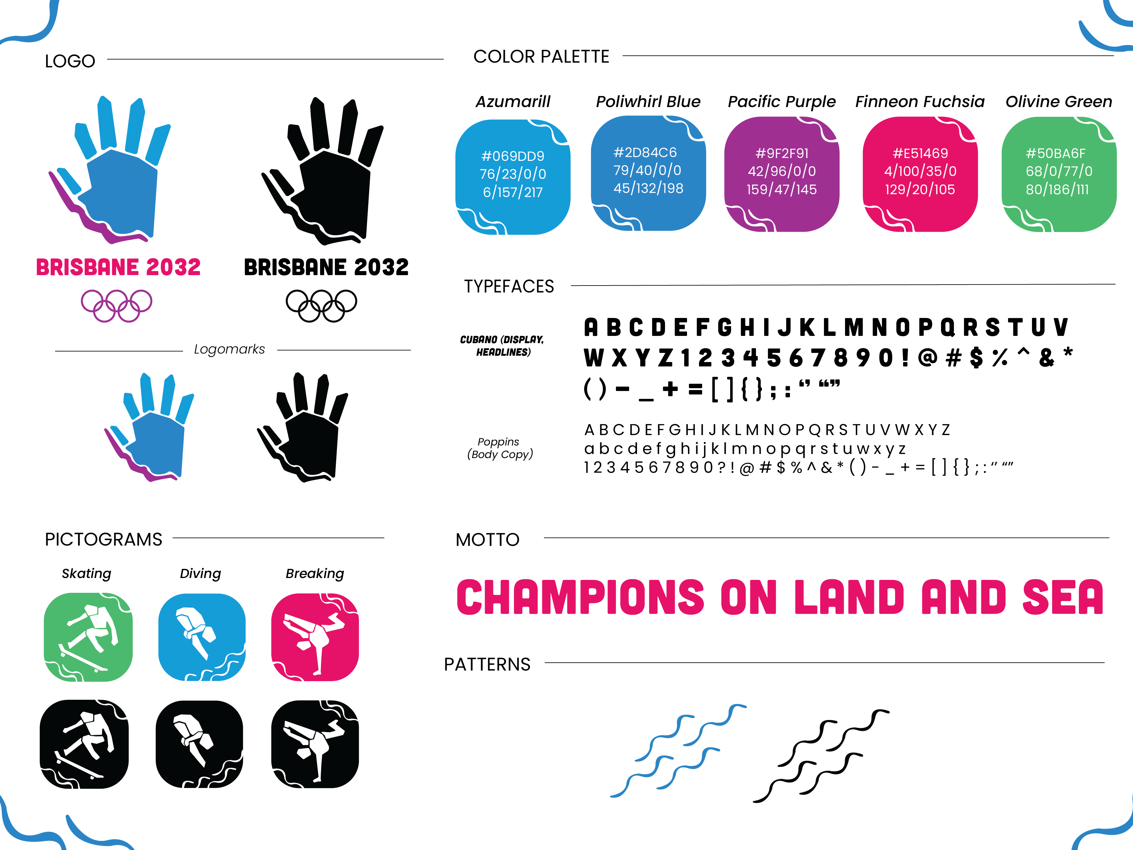
The logomark was inspired by cave paintings that were created by the Aboriginal people in Queensland, as I wanted to pay respect to an underrepresented community in Australia. The purple stroke represents the Shape of the Brisbane River.
I developed a palette that incorporated vibrancy, freshness, and hues not commonly seen in the Olympic Games.
I wanted people to think of aquariums when they saw the branding guidelines, which also influenced the creation of the wave pattern. I also designed pictograms for sports that I felt embodied Australia’s “adventurous” reputation.
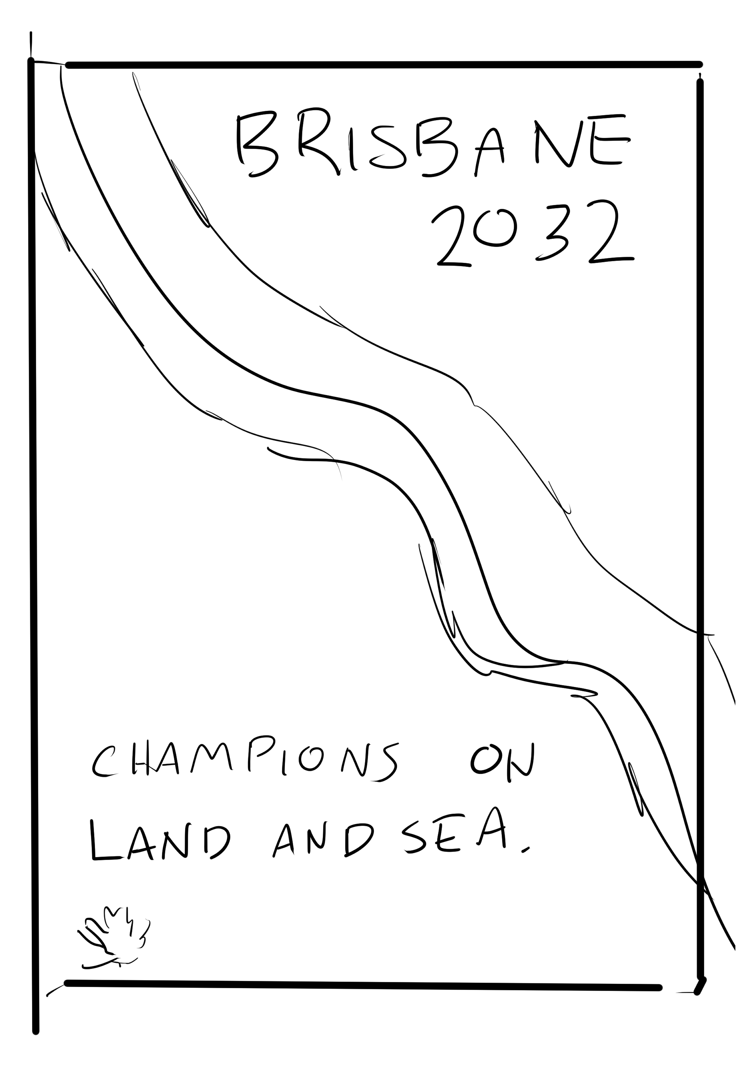
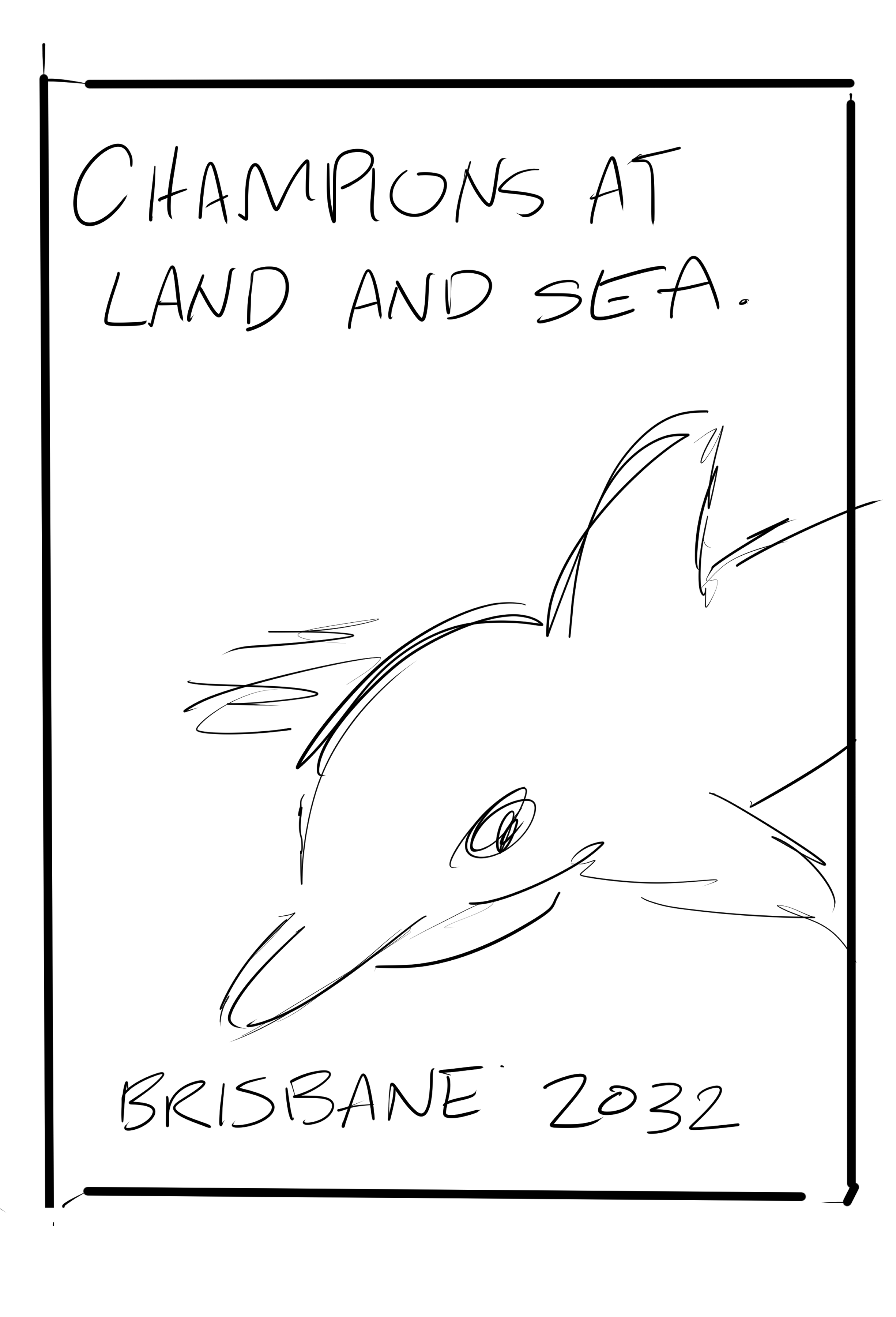
Promotional Poster

For the poster, I wanted a large emphasis on the water, so the audience would feel as if they were in the oceans themselves. I learned how to work with blending modes in Illustrator to achieve the ripple effect and light-ray look.
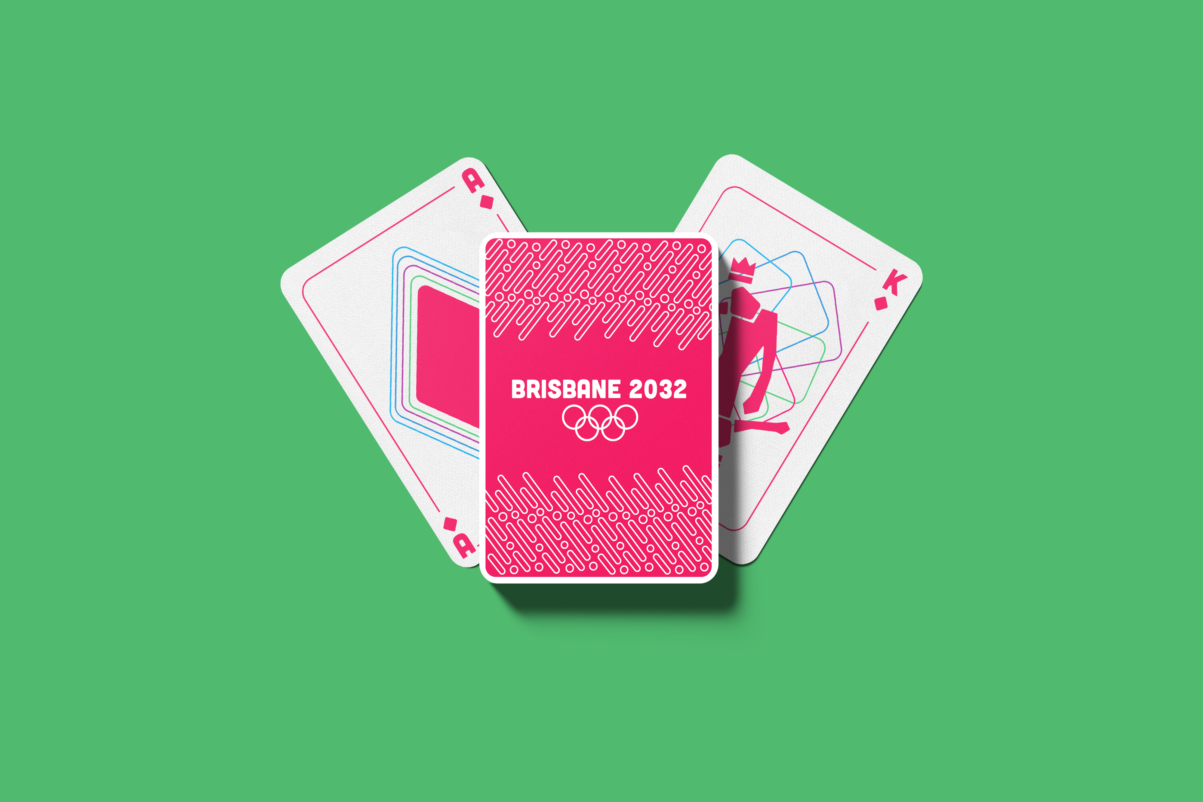
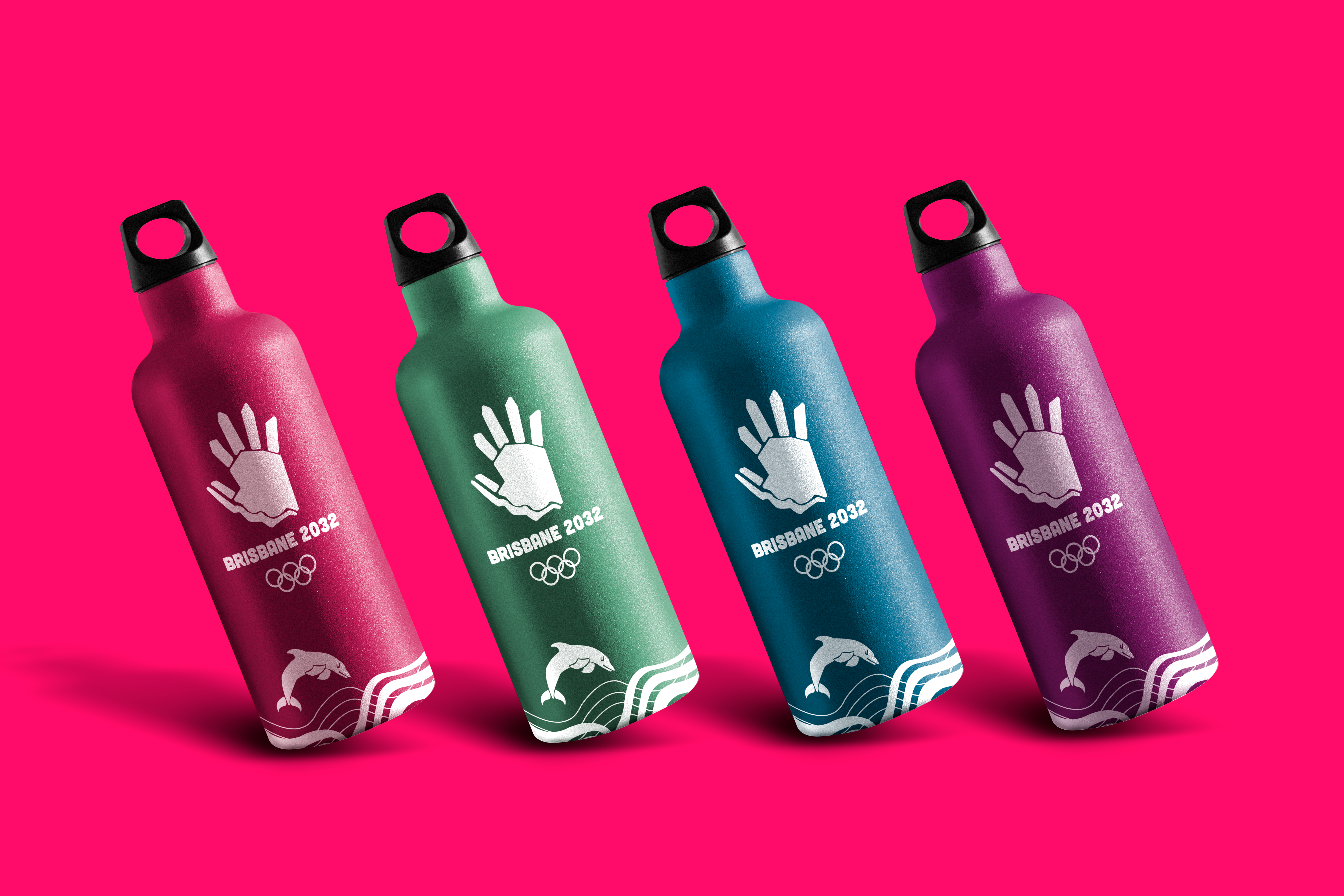
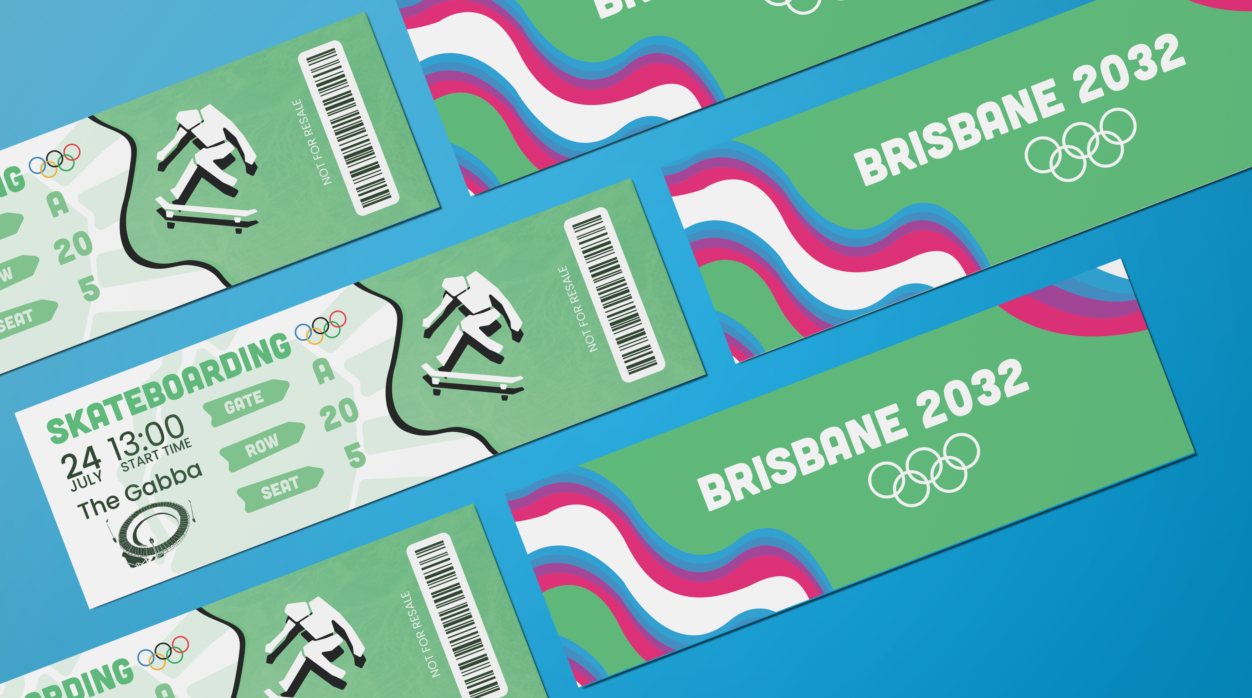
Merchandise
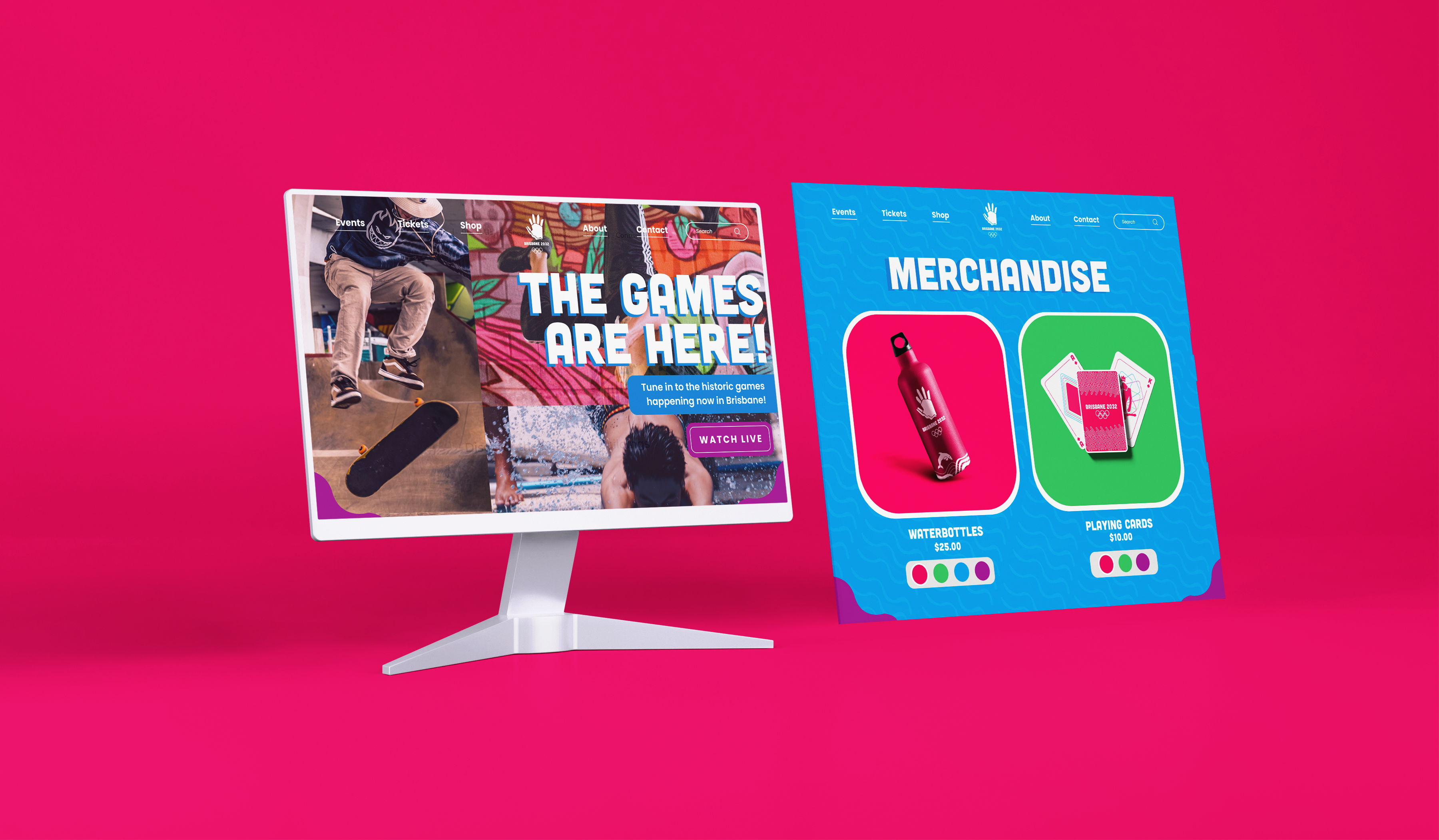
Digital Media
My final deliverables were creating two web page layouts for the Games. I designed a home screen and a merchandise screen using Figma.
Takeaways
This project was the first time I designed a full identity system for a brand. I think learning from how the Olympics Committee designs for such a large-scale event taught me how to make each piece of my system fit cohesively together.
Initially, I felt overwhelmed by how much work there was to do, but my professor helped me along the way by breaking down the assignment into four mini-projects, which helped me stay on track and make adjustments to previous pieces when necessary.